
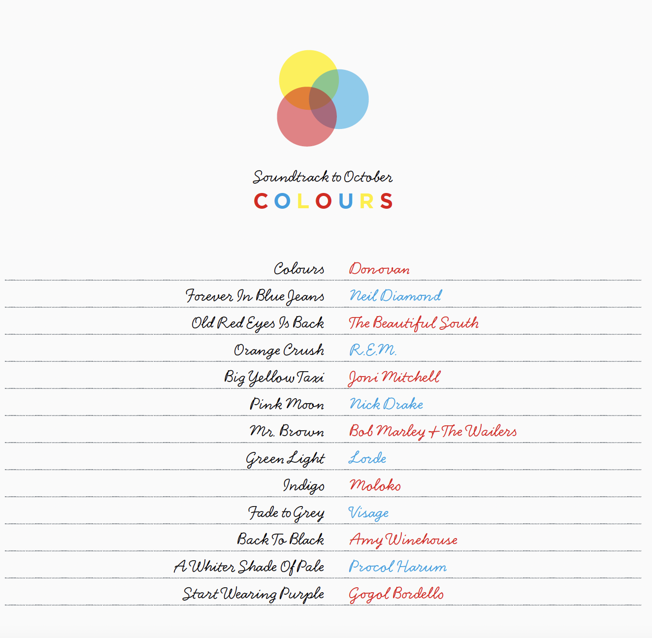
Embrace a rainbow of colours with our October playlist. Take a listen on Spotify here.
We publish a playlist every month: you can browse through them all here.
Our October issue, SEED, is on sale from 27 October. Visit picsandink.com to order a copy, or pick one up in your local shop.
Photography: Carmel King
Primer | colouring colours we loved
September is ‘new pencil cases’ time for us. Join us in a celebration of colouring crayons
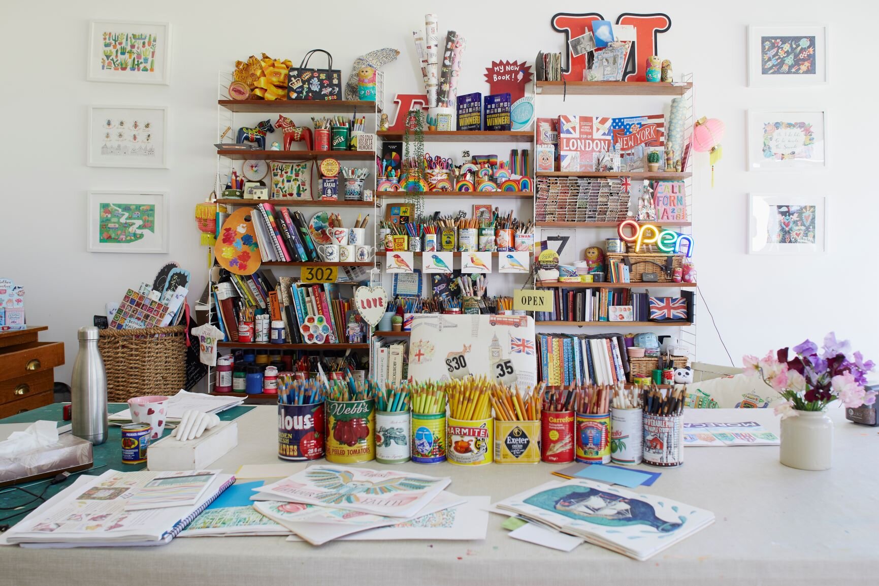
There’s not much that cheers our hearts more than the idea of a bit of new stationery. Once you’ve sharpened your colouring pencils ready for the new term, buy a copy of our September issue, in which we have a Sketchbook Club feature with artist Jennie Maizels to help you learn to draw beautiful birds. We also were lucky enough to visit her colourful home, and you can see those pictures and read all about it from p94. We particularly coveted her bright studio with its pots upon pots of colouring pencils, paints and crayons, and it reminded us of a time when we knew the ‘names’ of all our crayons and always had a favourite - definitely a top ten at least.
So here, in no particular order and judged completely on whim and without reason, are our favourite Crayola Crayon colours. Do share yours with us in the comments section below.
Cerulean. Blue is repeatedly voted the nation’s favourite crayon colour. After all, it deserves some credit after all that stoic painting of skies and seas. Plus, we just loved the name. Why aren’t more children called Cerulean?
Inchworm. Named for the bright green caterpillar of the geometer moth (which disappointingly is itself a sludgy brown). It reminded us of the Hans Christian Andersen song, too.
Macaroni and Cheese. A warm orange hue, named by a child as part of a competition Crayola ran in 1993 with Kraft Foods.
Purple Mountains’ Majesty. This scores points for just being really fancy - and giving Farrow and Ball a run for its money.
Corn silk. Back in the good old days, crayon colours were a bit educational, too. We mused for hours (while filling in suns and sandy beaches) over what corn silk might be. Turns out it’s the stringy bits on the top of a corn cob. Anyway, it’s a much better name than the brighter Unmellow Yellow… who wants their yellow UNmellow?
The colourful array of colouring things in the picture by Carmel King above is from artist and founder of Sketchbook Club, Jennie Maizel’s home, which is featured in our September issue. You can find a tutorial on how to draw birds by Jennie on page 102. Jennie has run Sketchbook Club from her home and online for five years. For all the kit you need to get started, including paints, pencils and paper, visit: jenniemaizels.com and head to Jennie Maizels’ Sketchbook Club YouTube Channel for supporting ‘How to’ videos for these projects. You can also follow Jennie on Twitter and Instagram at @jenniemaizels.
Buy this month's The Simple Things - buy, download or subscribe
More from our September issue…


More Sketchbook Clubs…


Mindfulness | Colour therapy
There could be thousands more colours than your standard rainbow seven, if you take a moment to consider how you might name them.
Anyone who’s ever had to choose a paint for a wall or a piece of furniture will have found themselves immersed in colour charts and sampler pots where there’s more to colour than their product codes or Pantone reference. Every shade, tone, and hue comes with its own name– chocolate comtesse, mineral grey, crushed oregano, millennial pink. In a description of just two or three words, a whole world can be conjured up or reimagined.
But what about all those colours yet to be given names? What would you call the blue the sky turns 20 minutes after a summer sunset, for example? Or the particular grey the clouds look when half the sky’s about to storm and the rest is brilliant sunshine? How should you describe the colour of your mother’s eyes, or define the shade you like your tea? Don’t let the paint companies have all the fun. It’s a mindful practice to look carefully at the colours around you and really see them.
ART PROJECT
Start a colour experiment to recreate colours you love in paint in a journal, logging what you mixed and in what proportions, and then name your colours however you like – striplight yellow, garden shed brick, bank holiday traffic. Baby’s comfort blanket, granny’s dining table, mum’s golden flecks. Colour can capture moments, memories and places as well as words or pictures.

More from the August issue:
Featured

More mindfulness:
Featured


The Stuff of Life: Home Tour Inspiration
White walls in the home are smart, modern and a blank canvas, but have you ever hankered after something a little more dramatic? If you’ve read the home tour in our current issue, you too might be tempted to move over to the darker side of the paint chart.
Peter Win’s Shoreditch flat has won us over: dark and moody grey with startling pops of colour, texture and beautiful decorative objects. Inspired by this beautiful home we’ve shopped The Stuff of Life to get the look. It’s time to get bold indoors. You can read the full feature and see more images of Peter’s flat in the November issue of The Simple Things, available now.


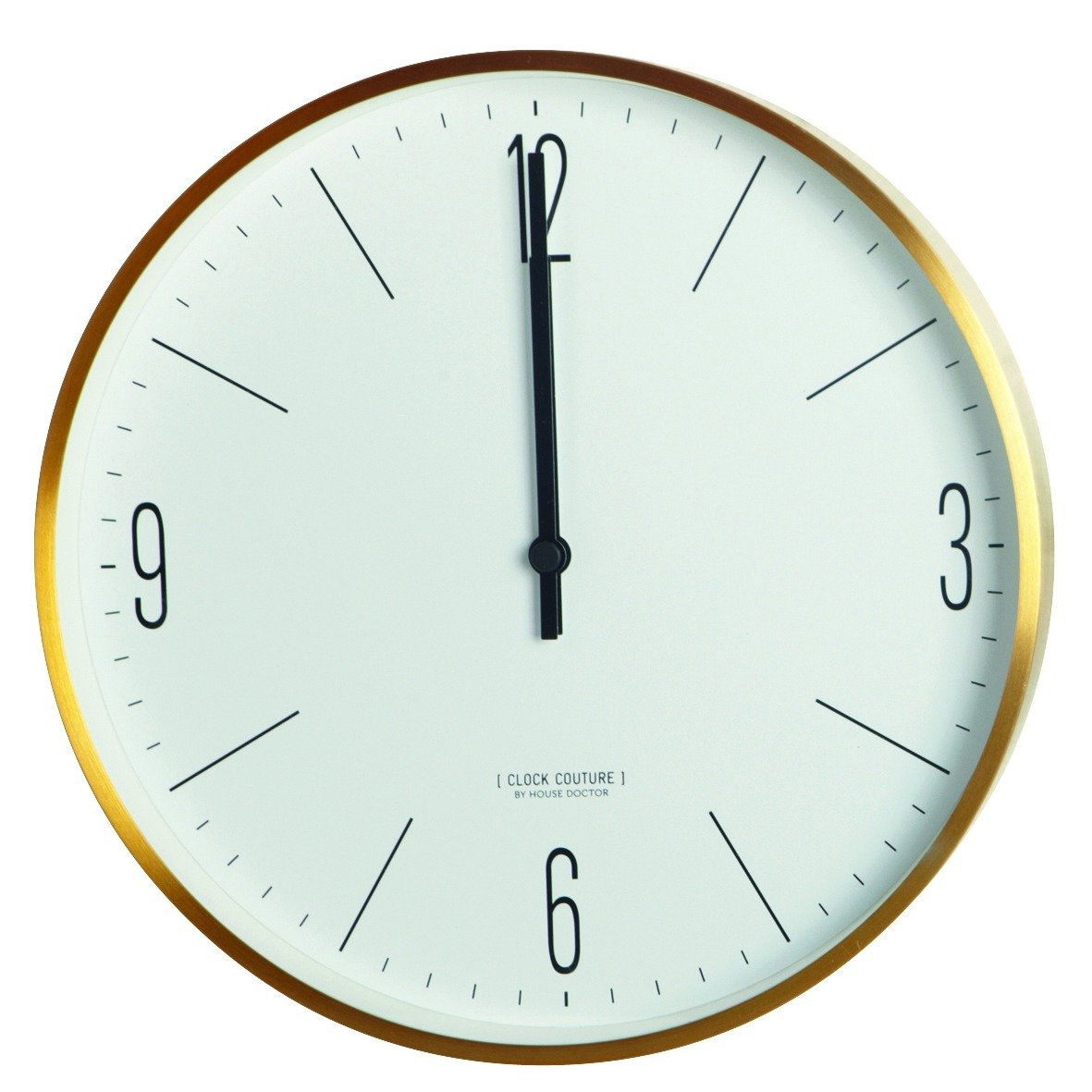


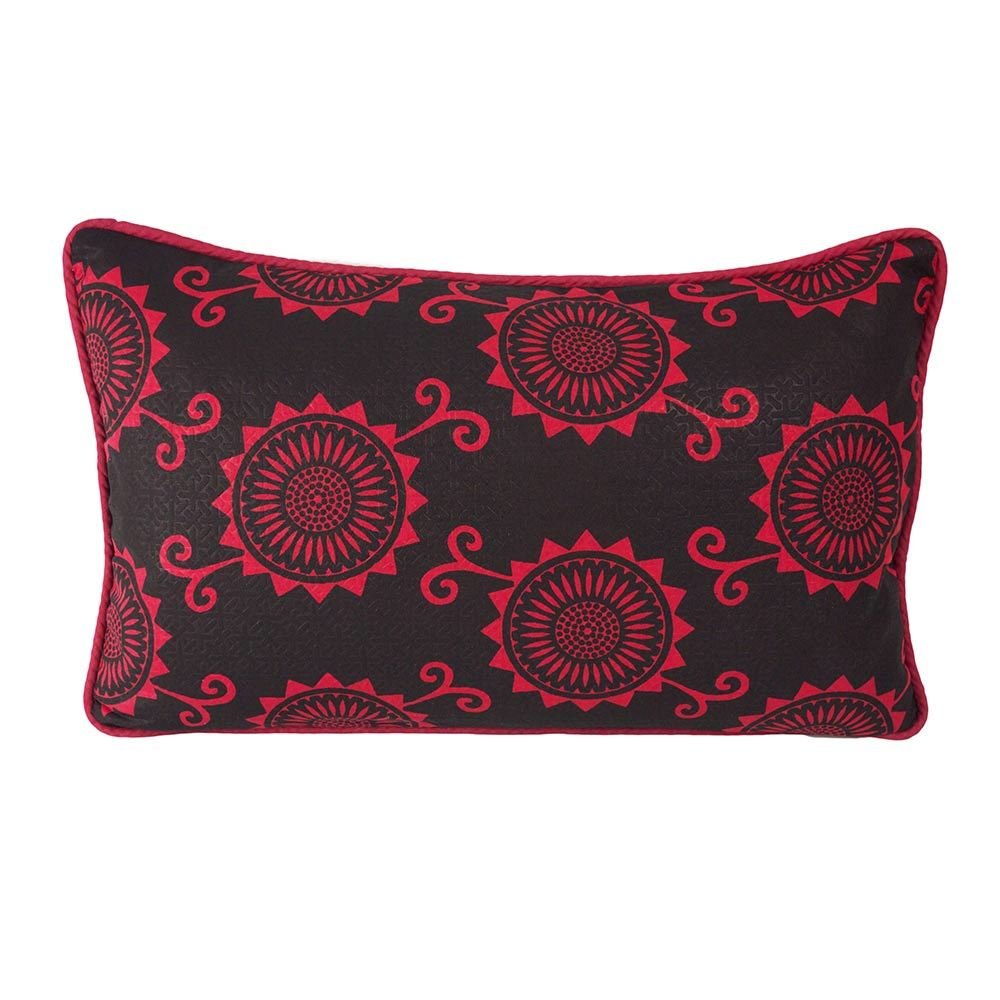
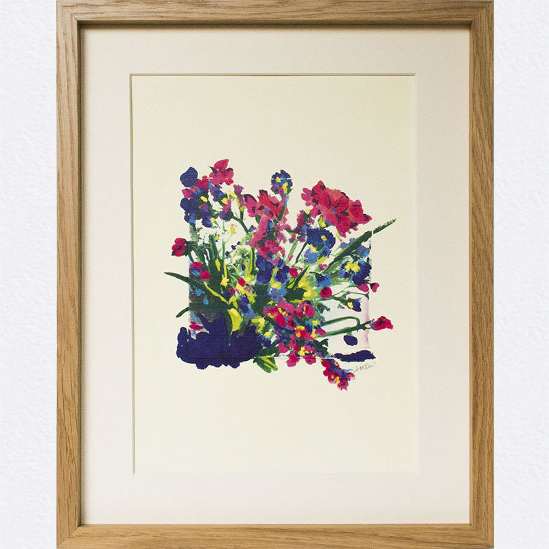

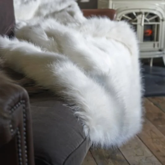
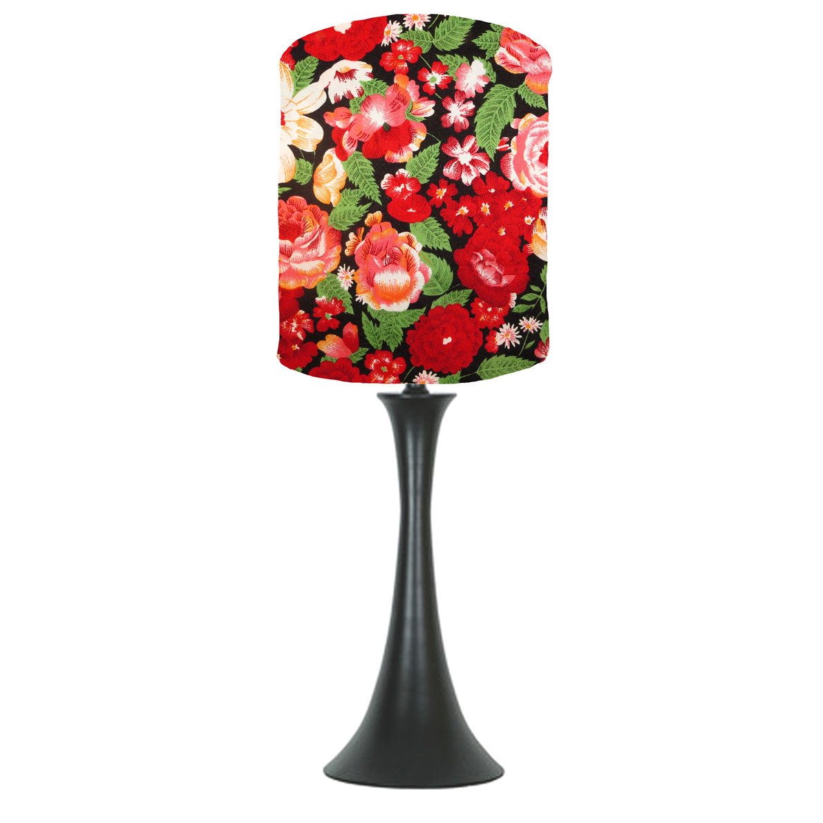
Images from top, left to right: Summery Quilts by Lisa Watson, from £245.00 | Black & Gold Brass Bowl by Home Address, £24.00 | Edible Botany Calendar by Alfie’s Studio, £12.50 | Gold Wall Clock by Home Address, £65.00 | Rose Bowl Vase by Home Address, £20.00 | Everyday Mug by Emma Lacey, £27.00 | Quick Brown Fox Wallpaper by Identity Papers, £65.00 per 10m roll | Sunflower Oblong Cushion by Stuff of Dreams, £30.00 | Wild England Limited Edition Print by Occipinti, from £28.00 | Belly Basket by Olli Ella, £25.00 | Faux Fur Throw by The Glam Camping Company, £230.00 | Red Vintage Lampshade by ByMarie, £25.00.